WE’VE RE-BRANDED!
Welcome to Fluoro Press! This re-brand has been a long time coming. I’ve been wanting to create a separation between me (Steph Ford, the artist) and the studio for a while now, because it has become so much more than just me, it has grown to be more of a community space, which is really what I always dreamed of. With the new year, and the new studio, it just felt like the perfect time to finally take the plunge. Now that this differentiation has been made, I hope that it will become more of an open-ended space that you all can kind of take claim of. Thanks to all of you who have been on this journey up until this point, I hope this change isn’t too confusing! If you have any questions please contact me. I have so many new and exciting things planned for this year, so stay tuned!
-Steph
P.S. I have done my best to make sure everything (web pages, socials, email, etc.) has been updated- if you notice any mistakes or lone mentions of “StephFordStudio”, please let me know! All new correspondences will be sent from “Fluoro Press” but anything sent to old emails will still be seen.
What’s a “Fluoro”?
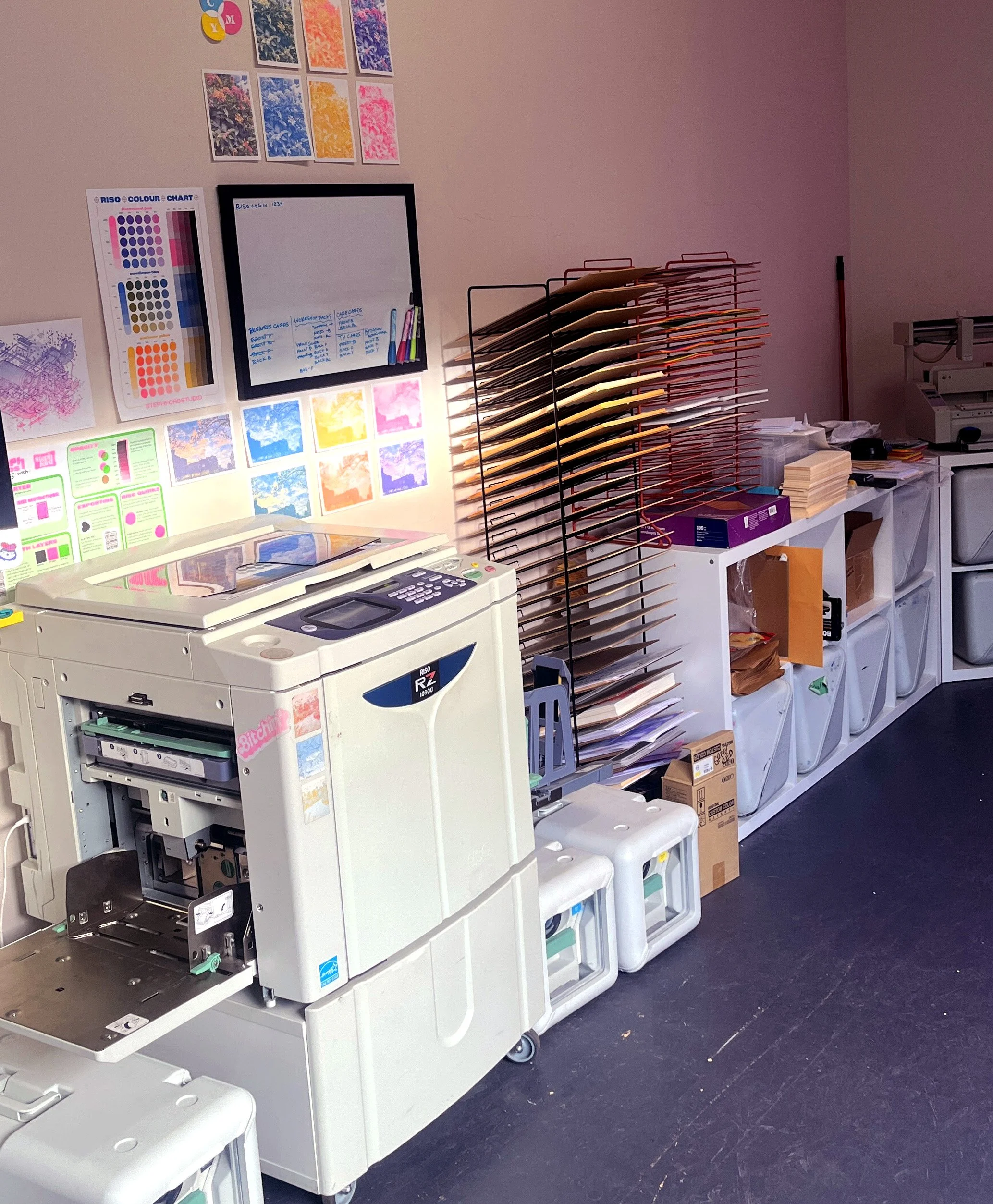
It’s just short for fluorescent, no big deep meaning. One of the things that makes Riso printing so special is the unique colours it can print with, namely their fluorescent colours. And if you know anything about me, it’s that the fluorescent pink is kind of my signature colour.
Who is “we”?
Well, it’s still just me! But using singular, first person pronouns as a “brand” feels kinda weird. So now, we use “we” and it can include both me and Betty, because she does all the hard work around here anyway. And we can throw Wormona in the mix too, as our personality hire.


